Our styled shoot for The Wedding Scoop: Love letters from a beloved

Thursday, 15 October 2015

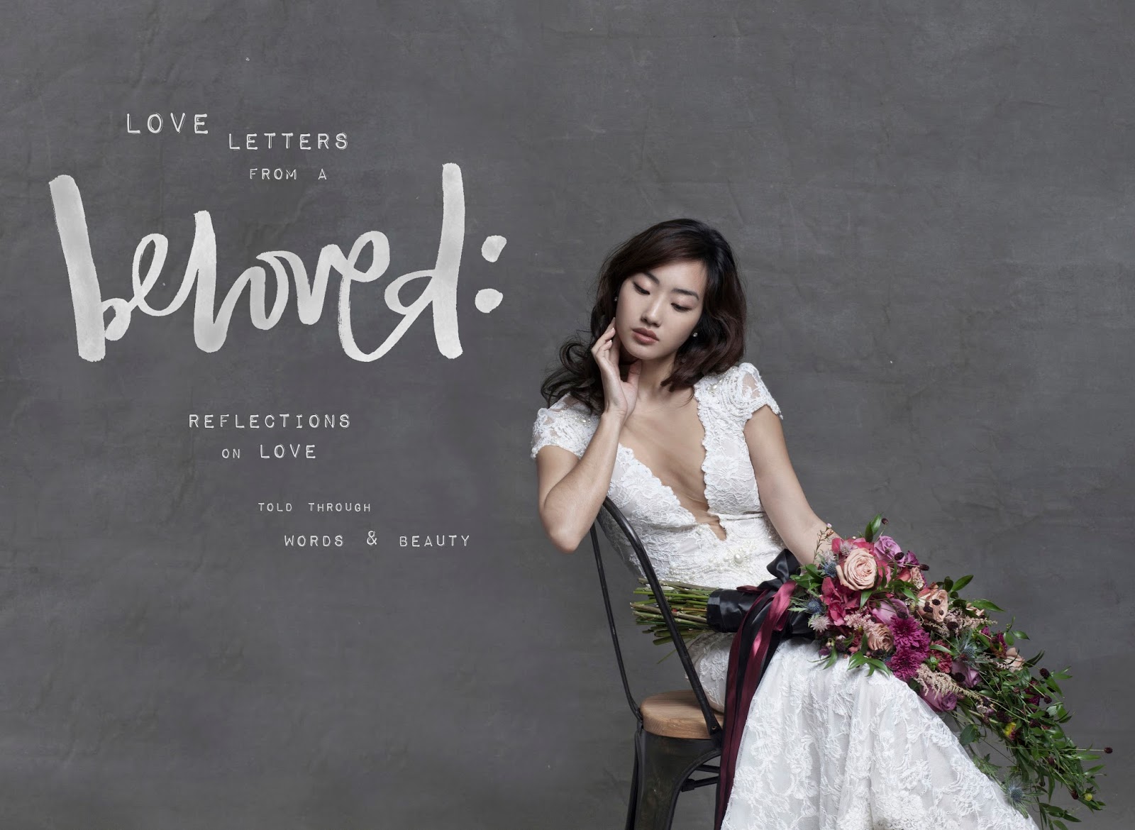
'Love Letters from a Beloved' takes a reflective and introspective look into the emotion of love, told through a collage of words & beauty. The storyline is inspired by a collection of quotes from classic poems by Leo Tolstoy as well as modern-day writers like Tyler Knott Gregson. The visual theme is inspired by the true modern bride - exuding an effortless elegance and intimate sensuality. Her makeup is soft and subtle; her hair is loose and flowing. Exquisite lace and textured details of her gowns are contrasted with fresh nails and bare feet. Floral arrangements are wild and free.

Equally effortless is the style of hand-lettering I've chosen - an organic freehand script written in brush, with a slightly unpredictable rhythm. Watercolour patterns were created through a careful mixture of digital and traditional mediums, complementing each photograph to form a compelling visual story.

Through 'Love Letters from a Beloved', we hope to bring back the beauty of studio wedding photography. Sometimes, less is more and there is beauty in simplicity."


And, a sneak peek behind the scenes for original concept boards we were toying with before finally deciding on marrying everyone's favourite parts (pun intended!)...


x,
jien

MOODBOARD: OF STONE, WOOD & WINE

Saturday, 28 February 2015

Lately, it seems like everything I do is drawing me back to the same colour palette of stone, wood and a mauve-coloured shade I've decided to call 'wine'.

Here is a moodboard / wishlist round-up of all the beautiful images and things I've been obsessing with. The organic tactile quality of polymer clay necklaces (yup, this obsession of mine knows no end), Zara's Spring-ready combination of thick knits and bright whites, my never-ending love for concrete / wood and the way these textures seem to go with anything and of course, that familiar simplicity of Aesop packaging.

It may be Summer all year round on this side of the world, but somewhere else Winter is coming to an end and Spring is beckoning. 


(all images via my Pinterest)

x,
jien

DESIGN #3: BREATHE IN THE FUTURE, BREATHE OUT THE PAST (free printables!)

Monday, 29 December 2014


2014 is really coming to an end!

I'm not sure about you guys but amidst the gaudy party hats, champagnes and streamers, NYE is always an emotional time for me. Perhaps the only time we ever truly pause our whirlwind lives for reflections and resolutions.

To mark this time of year where we transition from old to new and from past to present to future, I created a special A4 print that's free for everyone to download.

And because I couldn't decide on just ONE colour, here are 4 colours for you to choose from:
black+white for the oh-so-chic minimalists (or let's face it - for those who don't have fancy printers);


white+pink for the 'Forever New' girls and white+blue for those who like their robin egg blues  ;)

Click below to download:
black on white
white on black
white on pink
white on blue

Once you've downloaded them, frame or tape them to your walls. Whatever you do, be sure to take that obligatory instagram shot and #witxfolly. We'd love to see how you style them!

Happy New Year, lovelies!
Here's to a bigger and brighter year x


xxx
jien


Design #2: On love & weddings

Saturday, 20 September 2014


xx
jien

Design #1: Jien for Where's Cinderella

Friday, 15 August 2014

A few months ago, the lovely Teri (@teeir on instagram) of Where's Cinderella asked if I'd like to re-design her label's identity.

Teri had a clear vision for Where's Cinderella; she wanted the label to move towards a timeless and elegant image for young working women. When asked about the story behind the name and its previous design, Teri explained the link between the whimsical idea of Cinderella and fulfilling dreams.

Both Teri and I knew we had to keep the label's feminine typeface while re-creating a more quirky and modern image of Cinderella's 'slipper'. After rounds of inspiration sourcing, moodboard curating and illustration, here's the final result :)

Before:


After:
xx
jien

Faith

Sunday, 10 August 2014


This is an interpretation of a self-portrait. 
Faith, I've learnt, is about letting everything happen to you - both beauty and terror. It's about letting others in and letting yourself go.

xx
jien

Collaboration #1: The Ordinary Co x WitxFolly

Tuesday, 5 August 2014


Photography by Monica Anne Lie
Necklaces from The Ordinary Co.
Illustrations by Wit & Folly


xx
jien & sipei

Travel Diary #2: The mountains are calling, I got to go.

Sunday, 3 August 2014

A surreal weekend in Queenstown & Wanaka and I've left a part of my heart in the snow-capped mountains. In an attempt to 'immortalize' the memory, I printed it down on paper inspired by my first homemade glass of Hendrick's Gin in my first airbnb apartment:


xx
jien


© WITXFOLLY All rights reserved . Design by Blog Milk Powered by Blogger